Ad of the Day: Tesco loses logo in new outdoor campaign
‘Icons’ campaign lets the food take center stage, with only the supermarket’s five chevrons hinting at the brand behind the stunt.

Tesco logo vanishes / BBH
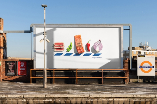
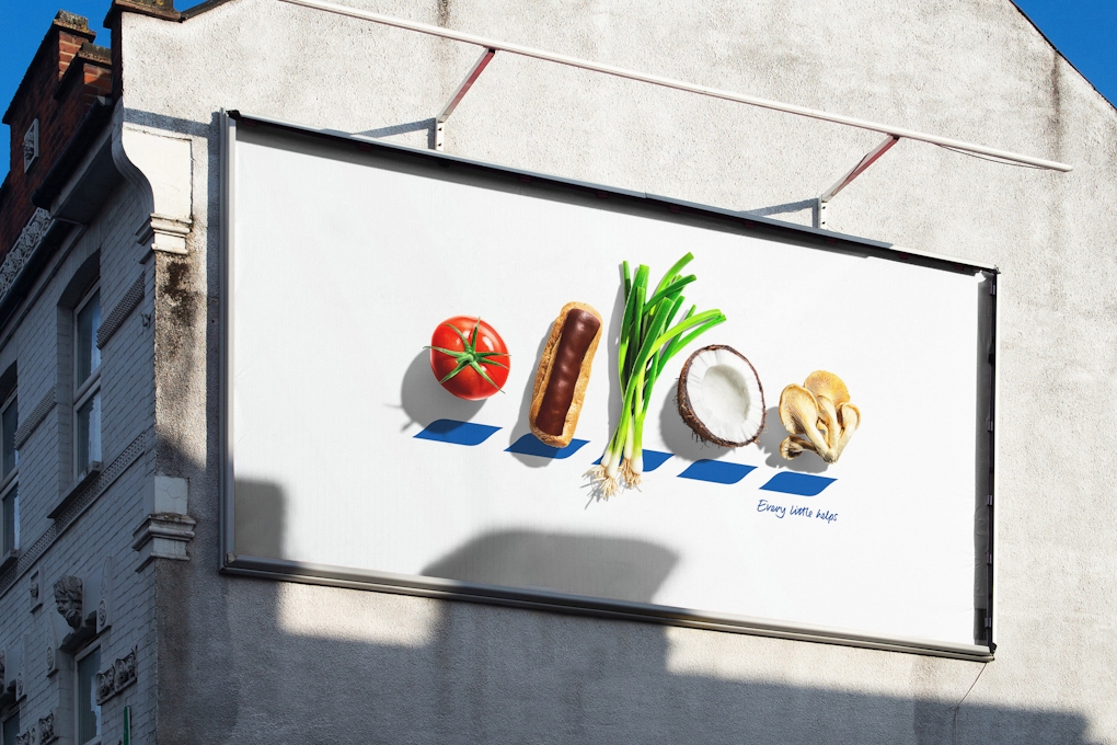
Tesco’s visual identity has been dismantled and replaced with food photography (or ‘Icons’) that replace the letters T, E, S, C and O.
The brand equity of Tesco’s chevrons was deemed strong enough by BBH London to be recognizable to passers and allow them to make the connection with the brand. This said, they will still read the familiar ‘Every little helps’ strapline.

Want to go deeper? Ask The Drum
“You need to have icon status to be able to play with your logo with such confidence,” says BBH deputy executive creative director Felipe Serradourada Guimaraes.
Food photography by Will Cooper captures the likes of a fried egg and a beef tomato. In the final design of the posters, the Tesco letters have been replaced by food that doesn’t remotely resemble the letter it replaces. It is however codified in the sense that the first letter of each food corresponds to the letter it replaces. Taking the idea this far gives it a further level of abstraction, but also suggests a sense of confidence.

Advertisement
Credits
Advertising agency: BBH London
Chief creative officer: Alex Grieve
Executive creative director: Helen Rhodes
Deputy executive creative director: Felipe Serradourada Guimaraes
Creative director: Felipe Serradourada Guimaraes
Copywriter: Lawrence Bushell
Art director: Luke Till
Head of design: Liam Thomas
Designer director: Miguel Sousa
Head of strategy: Saskia Jones
Advertisement
Managing partner: James Rice
Account director: Millie Dann
Production director: Rachel Clarke
Photographer: Will Cooper
Suggested newsletters for you
Production company producer: Kay Edwards
Production company: Rare/At
Collective post-production: Wellcom

