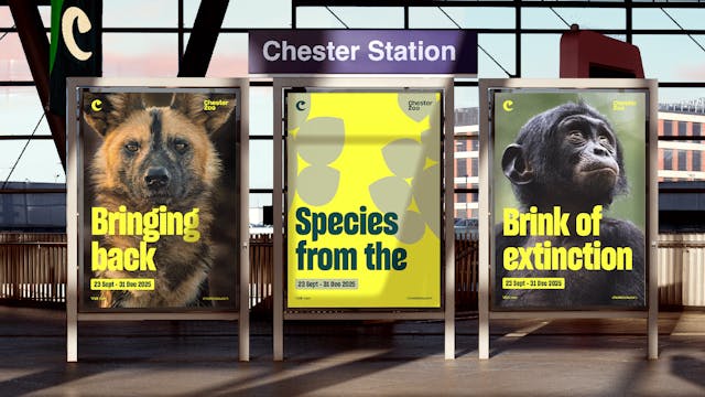
Is ‘zoo’ a dirty word? Chester Zoo repositions around conservation
The new How&How-designed identity shifts the brand’s focus from fun days out to conservation.
When Chester Zoo approached How&How in December 2022 with a brief to reposition from a family visitor attraction to a global conservation organization, it had already undertaken an extensive period of research to find out whether it should be called a zoo at all.
The upshot was that some potential visitors didn’t like the idea that people could be profiting from animals, rather than having any misgivings about the word ‘zoo.’
Want to go deeper? Ask The Drum
Head of brand and marketing, Helen Dean, says: “Around 27% of people we spoke to said they were unsure about zoos and there was a bit of tension there, but when we explained we were an international conservation zoo, they thought that messaging resonated with them and they’d take their family.”
Just in case any greenwashing alarm bells are going off at this point, it’s important to state that Chester Zoo is a not-for-profit organization and funnels its takings into international conservation work, which includes breeding programs and education.
On the domestic front, the zoo is a major operation with 2.1 million annual visitors, making it the UK’s largest attraction outside of London.
Advertisement
Through redesigning the zoo’s identity, How&How was tasked with showing visitors what the conservation work looks like and the impact it makes.
Different strategic routes were then explored, reflecting the evidence-based results of Chester Zoo’s work in helping with biodiversity, reintroducing threatened native species and making positive conservation changes.
Advertisement
The proposition, which has come out of How&How’s own audit and stakeholder and market research, is the brand idea and tagline ‘Force of Nature,’ which How&How creative director Cat How says is representative of both “the passion and drive of those working within the zoo and those working on conservation projects that it is contributing to around the world.”
All of this underpins the new visual identity, which begins to replace the incumbent identity across all touchpoints today.
At its center is the letter ‘C’ with a hidden rhino horn, which represents the zoo’s pioneering breeding program work to help bring back the eastern black rhino from extinction. “It’s the jewel in the crown of its conservation work and we chose it as the black rhino already felt like a bit of an emblem for it,” says How.
Suggested newsletters for you
An icon set had been designed to represent different categories of animals, such as amphibians, birds and mammals, and from these, the rest of the shape of the C was honed. It sits alongside a custom wordmark with “sharp corners and flowing curves,” says How.
In turn, the icons are the basis for animations inspired by migration patterns and animal flocking. An illustration, pattern and icon library has been built up for the zoo’s use.
The icons have also informed custom type, which has been modified from Sharp Grotesk to tie in with the other elements of the identity. The agency worked with Lucas Sharp from Sharp Type to get the essence of the icons into the letter forms.
“Removing the rounder forms in favor of sharpness and ‘force’ helped us to build on the brand idea,” says How. This is being built out across communications with yellow as the primary brand color and green as the secondary, “which the client took a while to come around to, but it’s so different to anything in their category,” she says, adding that yellow was also chosen to signal “alarm and urgency.”

To-the-point copy and what appears to look like animal portraiture are used to communicate some of the conservation messages. All of this is designed to “express Chester Zoo’s action and positive momentum with lashings of energy,” adds How.
The whole system has been designed to work for adults and children alike and is rolled out across physical touchpoints and wayfinding at the zoo, online and across external communications.
The site has been designed with its own digital toolkit focusing on what How calls “a sense of abundance and choice” across interactive video cards and full-screen galleries.
The identity is “designed for their ambition, not their current state of being,” she says, referring to the zoo’s continuing conservation work, its plans for the first multi-habitat enclosure in Europe, which will create a more optimal environment for the animals on site, and £125m of further planned investment in its future.
It seems that although the word ‘zoo’ carries negative connotations for some people, communicating clearly what a zoo does – if there’s good being done – is more important. Indeed, replacing it with something else can seem disingenuous and, ultimately, visitors will have to decide whether they’re happy with how a zoo conducts itself.
Head of brand and marketing Dean recalls how Chester Zoo was called Chester Zoological Gardens in the distant past and says that wouldn’t feel appropriate today. “Other zoos try ‘wildlife parks’ or ‘sanctuaries’ and there are all sorts of ways you can articulate what is basically the same proposition, but we’re really proud to be a conservation zoo, so we wanted to keep the name and demonstrate how important this zoo is to global conservation.”

