Pastiglie Leone brand reinvigorated through ‘sensory escapism’
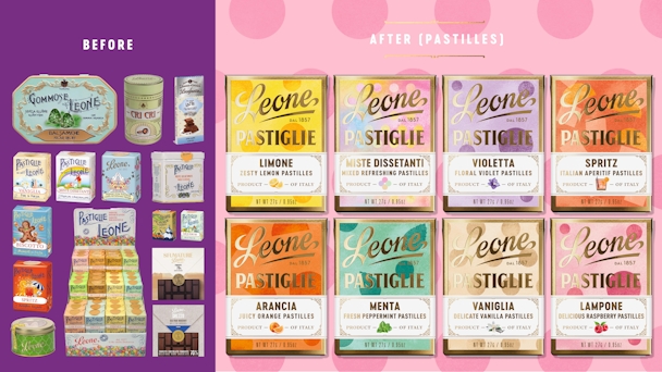
Winning Gold at The Drum Awards for Design in Refresh of an Existing Brand is Design Bridge and Partners and Pasiglie Leone with Pastiglie Leone: La Dolce Vita. Here is the award-winning case study.

Design Bridge and Partners took inspiration from the original Leone factory / Leone
Moving moments of pure happiness. Reinvigorating an Italian national treasure. Inspired by a unique fusion of taste, beauty and the very essence of Italy.
Founded in Turin in 1857, Pastiglie Leone is one of the most iconic Italian family manufacturers. Part of the fabric of life for every Italian growing up, Leone’s unique candies seek to inspire all the sense with indulgence, unveiling ‘magical moments’ within every box. We created a brand to visually unify its diverse portfolio, whilst preserving the authentic artisanal heritage of a loved iconic brand. The brand needed to change, but without changing a thing.
Want to go deeper? Ask The Drum
By diving into the history and beautiful family story of Pastiglie Leone, we discovered that the solution hid within their DNA—a unique fusion of taste, beauty and the very essence of Italy.
For 160 years, Leone’s wild imagination has been expressed through the surprising and innovative flavors and the detailed, intriguing idiosyncratic pack designs that hint at simpler, happier times. We brought the brand to life with the creative idea, ‘Sensory Escapism’. As the antidote to all the stresses, anxieties and uncertainty in the world, consumers yearn for moments of pure happiness that allow us to escape, even for a short moment.
Advertisement
We wanted to create a brand to visually unify its diverse portfolio, while preserving the authentic artisanal heritage of a loved iconic brand, to ensure its legacy for generations to come.
For the brand identity, we took inspiration from the original Leone factory, whose architecture, color and filigree ironwork throughout the building oozed Wes Anderson vibes, and its hand-painted logo perched atop the building was a key presence for the brand.
Capturing the character and quirks of the brand’s Italian heritage, the typography draws on the classic street signs of Turin with embellished underline strokes and playful characters, to craft a wordmark for today—one that embodies the personality and craftsmanship of a brand that prides itself on perfection.
Advertisement
Working with Italian sign writer Nicolo Giacomin, we added stature and recognition to the logotype, transforming it into a mark with history and modern confidence.
On each pack, the graphic patterns are formed from the iconic shapes of the pastiglie and sealed with a gold ‘L’ stamp as a sign of quality found within the family’s archives.
The new Leone brand has reinvigorated an Italian national treasure, one that defines the next chapter in its history, capturing the rich heritage of a loved iconic brand, infused with decadent Italian craft and contemporary quirks. The visual identity communicates Leone’s core promise to customers; the rediscovery of a world full of exploration and discovery — an emblem of superlative sweetness.
The new brand was rolled out on the shelves of 7675 stores across Europe, from the Westin Palace Hotel in Milan to the Le Fromager des Halles in Paris. It masterfully unites a complex portfolio steeped in heritage and nostalgia, with the same enticing character, transforming Leone into a global delight.
Massimo Pozzetti, CEO, Pastiglie Leone, “Driven by rebranding a well-defined commercial strategy, we have affirmed our leading position in super premium confectionary. The company is experiencing a period of extraordinary growth and expansion, driven by the iconic pastilles, both in Italy and in the rest of the world.”
Ready to get your work recognized on a global stage? Enter The Drum Awards today. Need more inspiration, read our Award Winning Case Studies.
